Playbooks
How to Use V7 Reporting Features
8 min read
—

Track, analyze, and optimize your data annotation workflows with ease. Explore new reporting features available in V7 for a deeper understanding of your datasets and labeling process.

Casimir Rajnerowicz
Content Creator


Data labeling
Data labeling platform
Get started today
You can’t improve something if you don’t measure it. Developing an AI model is no exception – without benchmarks, you’re shooting in the dark. It's critical to choose the right metrics that will provide clear indicators of progress and areas for enhancement.
We’ve introduced new reporting features that will help you understand your datasets and your annotators better.

Our new reporting capabilities offer a range of benefits to streamline and enhance your data annotation and model training processes. You can access metrics regarding the quality of your training data, download CSV reports, and generate custom reports via the API.
Key benefits of data annotation reports:
Enhanced Annotation Efficiency. With our new metrics, you can monitor and improve your data annotation process more effectively. This leads to better resource allocation, task prioritization, and the swift resolution of bottlenecks.
Superior Quality Assurance. Our reporting tools help ensure the high quality of your training data, with metrics like annotation accuracy and task completion time. This guarantees the reliability and precision of your AI models.
Improved Team Collaboration. Clear and accessible KPIs lead to better team collaboration, transparency, and accountability, especially in joint data annotation efforts.
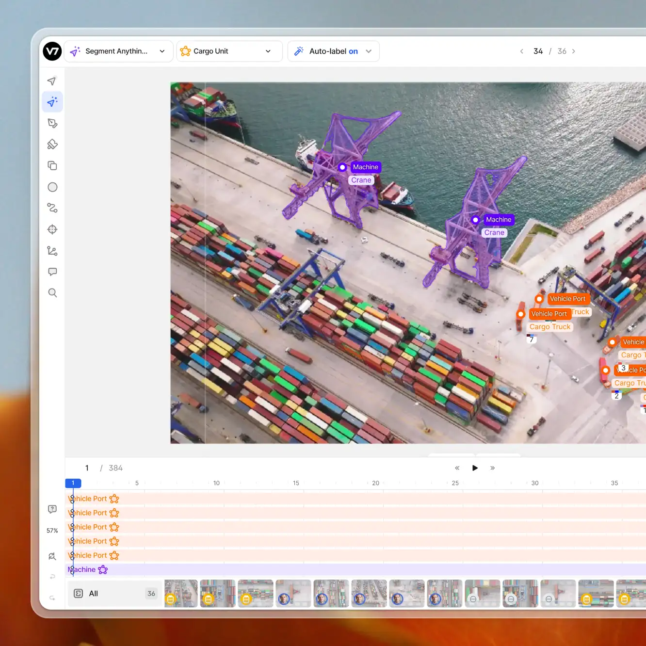
How to monitor your data annotation projects in V7
In V7, you can track metrics and KPIs related to your annotation projects using several different methods. Each offers a unique set of information. Some methods provide insights at the dataset item level, while others allow you to collect metrics based on individual annotators or time frames.
You can find metrics related to your project in:
Quality tab. Dataset completion and class distribution metrics.
Annotators panel. Time-based charts and logs with information about approved/rejected annotations.
Downloadable CSV reports (Recommended). Each new row of the report represents one file in the dataset. These reports can be generated both in the Quality tab and the Annotators panel.
Downloadable hourly logs. Each row represents one day, showing the total annotation time and annotations completed by specific annotators in a given day.
Custom reports. You can fetch detailed information and generate advanced reports via API requests.
⚠️ If annotators work with the same file on multiple occasions, the hourly or daily reports can sometimes count one item several times. That's why it is recommended to use file-based reports, such as the downloadable CSV, or to use longer time frames in custom reports.
As you can see, there are multiple places where you can find the appropriate data, depending on your needs. If you require information about the completion status and the class population, a quick glance at the quality tab may suffice. Conversely, if you're interested in the individual performance of your annotators, a custom monthly report may offer a deeper understanding of the time your workforce spends on completing specific tasks.

While some reports include visualizations and charts within V7, using the API to generate custom reports can unlock additional insights and assist in building your own KPI dashboards. This enables you to fetch detailed information with varying levels of granularity and within specific time frames.
Now, let's explore how to collect information with the updated API features for reporting.
Generating custom reports via the V7 API
To build a custom dashboard, you should decide on a framework that your fetching mechanism will use and your data visualization method. For example, we can set up a custom dashboard for measuring the average annotation time by specific annotators in Looker Studio (Data Studio), using JavaScript to request the metric via API calls and Google Sheets as our intermediary.
The steps are as follows:
Write the API Request. Refer to the documentation to construct your request.
Trigger the API Call and Parse the Response. Automate data fetching with tools like Google Apps Script.
Visualize the Results. Utilize platforms like Looker Studio to create interactive dashboards.
Let’s discuss each of them in detail.
Step 1: Write the API request
Before we start, generate a new API key and save it. We’ll need it for authorisation.

You also need a slugified name of your team. To find it, visit the Settings tab of any dataset, as datasets use the “/slugified name/dataset name” structure.
Once you have your API key and the slugified name of your team, you can visit this page to construct and try out your request. Set up the parameters and generate your code for a specific framework, such as Shell, Python, or JavaScript.
Query parameters include:
1. Metrics:
Number of stage transitions
Annotation time
Review time
Total annotations
Time per item
2. IDs:
User ID
Dataset ID
3. Date and granularity
Start date
Stop date
Monthly/weekly/daily/hourly breakdown*
4. Grouping by:
Annotators
Datasets
Stages
⚠️ Hourly reports may not reflect the latest changes and can double-count files worked on across separate hours. This is particularly relevant for lengthy tasks like DICOM series labeling or video annotations. For up-to-date and accurate tracking, consider using longer time frames or the downloadable CSV reports.
In our example, we’ll use Google Sheets for fetching the V7 data. That’s why we’ll use JavaScript, as it is most suitable for setting up our automatic fetching mechanism.
Let’s assume that we are interested in retrieving information about total annotations per user per month complete with average annotation time.
Our request looks like this:

All of the information is included in URL parameters. The complete link in this case is:
The parameters after the question mark, such as metrics[]=time_per_item, are used for determining which metrics we want to fetch.
Here is the response:

Note that the results include actor_id instead of the names of specific team members. This approach is used to protect the identity of annotators. However, if you wish to obtain information about unique users' IDs, you can use a different API request as outlined here. Once you determine who is who, you can replace IDs with real names during the response parsing in the next step.
Step 2: Write the script that triggers the API call and parses the response
As you can see, extracting specific metrics is very easy and you can generate your code snippet without creating any custom code. However, creating an interactive dashboard may require some additional effort.
For our example, where we intend to fetch V7 data using Google Sheets, we will utilize Google Apps Script, which is based on JavaScript. Google Apps Script is the scripting language natively supported by Google Sheets for creating custom functions, automations, and interactions with other Google services or external APIs.
Create a new Google Sheets file and go to Extensions > Apps Script to add code. Keep in mind that the request generated in step one is just a fragment of the full script. Different implementations may require tweaking certain parts and configuring additional functions. However, you can try to modify the logic and generate the correct snippet using ChatGPT.

We can set up an automation that will trigger the function with time-based rules. For example, the data can be fetched every several hours and updated in existing cells or saved in a new row of our spreadsheet . If we don’t want to overpopulate the sheet, we can also use additional parsing logic and convert specific values into more general names.

Once you are done, check the execution logs and the document itself to see if the fetching script is triggered correctly. Note that in the example provided, values are updated hourly, yet the time frame and granularity are set for the full month, as the focus is on November. This way we can avoid items being counted twice.
Step 3: Visualize the results and set up dashboards
Once our automatic request mechanism is configured we can turn metrics into charts. In this example, we’ll use Looker Studio and connect it with the Google Sheet file. We can add the file as our data source and map specific columns onto specific elements of our dashboard.
Additionally, we can add custom filters, which will allow us to filter the results by additional parameters, such as user or dataset IDs.
Looker Studio (also known as Data Studio) is just one of the popular options, but depending on your unique needs, you can use other 3rd party solutions. If you want to create a sharable KPI dashboard or a leaderboard, you may want to consider a different app. Many businesses use apps like Tableau or Geckoboard.
What metrics should I use for my annotation project?
Each metric offers a unique perspective on different aspects of your project, from the speed and accuracy of annotations to the overall flow of the annotation process. Understanding how to measure and interpret these metrics can greatly enhance your ability to manage your training data annotation project successfully.
Here are some essential parameters and dashboard ideas that can help you:
Annotation Time vs Review Time
Use a combination of bar charts to represent annotation and review times. This dual approach provides insights into not only the speed of annotation but also the time taken for quality checks and reviews. Tracking these metrics helps in balancing the trade-off between speed and accuracy. This translates into high-quality data annotation without compromising on efficiency.
Total Annotations and Time Per Item
Create a scatter plot to correlate the total number of annotations with the time taken per item. This visualization offers a clear picture of annotators' productivity and the complexity of tasks. It's particularly useful for identifying whether certain types of data or specific annotators require more time, indicating a need for additional training or resources.
Number of Stage Transitions
Implement this metric to design a nice funnel visualization. This chart can depict how data moves through different stages of the annotation process (e.g., initial annotation, review, final approval). Tracking stage transitions helps in pinpointing stages where delays or quality issues may occur, allowing for timely intervention and process optimization.